はじめに
この記事を読めば、JavaScriptで座標回転をマスターすることができるようになります。
JavaScriptを始めたばかりの初心者でも、基本から応用例まで学べるようになっていますので、ぜひ最後までお付き合いください。
●座標回転とは
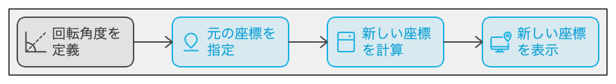
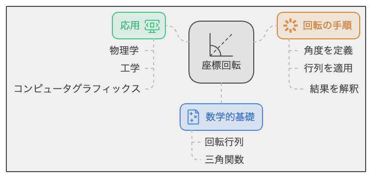
座標回転とは、2次元や3次元空間において座標を一定の角度で回転させる操作のことを指します。
JavaScriptを使えば、座標回転を簡単に実装することができます。
これにより、ウェブページ上で画像やテキストなどの要素を回転させるアニメーションやインタラクティブな操作が可能になります。
●JavaScriptでの座標回転の基本
○座標回転の数学的な背景
座標回転の実装には、一般的には三角関数が用いられます。
例えば、2次元座標系において、原点周りにθ度回転させる場合、新しい座標 (x’, y’) は次の式で求められます。
x' = x * cos(θ) - y * sin(θ) y' = x * sin(θ) + y * cos(θ)
ここで、θは回転角度で、ラジアン単位で表現されます。
JavaScriptでは、Math.cos()とMath.sin()関数を使って三角関数を計算できます。
○JavaScriptでの座標回転の実装方法
座標回転を実装するには、上記の数学的な背景をJavaScriptのコードに落とし込みます。
2次元座標の回転を実現するための簡単なサンプルコードです。
function rotate2D(x, y, theta) {
const rad = (Math.PI / 180) * theta;
const x_rotated = x * Math.cos(rad) - y * Math.sin(rad);
const y_rotated = x * Math.sin(rad) + y * Math.cos(rad);
return { x: x_rotated, y: y_rotated };
}
この関数は、x, y 座標と回転角度 theta を引数に取り、回転後の座標をオブジェクトとして返します。
実際に回転させたい要素に適用するには、この関数を利用して新しい座標を計算し、要素のstyle属性を更新します。
●座標回転の使い方: 10選のサンプルコード
○サンプルコード1:2D座標の回転
このサンプルでは、2次元座標 (100, 50) を30度回転させます。
rotate2D関数を使用して、回転後の座標を計算します。
// 2D座標の回転を行う関数
function rotate2D(x, y, theta) {
const rad = (Math.PI / 180) * theta;
const x_rotated = x * Math.cos(rad) - y * Math.sin(rad);
const y_rotated = x * Math.sin(rad) + y * Math.cos(rad);
return { x: x_rotated, y: y_rotated };
}
// 座標 (100, 50) を30度回転させる
const rotated = rotate2D(100, 50, 30);
console.log(rotated); // { x: 61.80339887498949, y: 95.10565162951536 }
このサンプルでは、rotate2D関数を使って2次元座標 (100, 50) を30度回転させ、回転後の座標をコンソールに出力します。
○サンプルコード2:3D座標の回転
3次元座標の回転には、回転軸に応じて異なる計算方法が必要です。
このサンプルでは、x軸周りに回転させる場合の3D座標回転を実装します。
// 3D座標のx軸周りの回転を行う関数
function rotate3D_x(x, y, z, theta) {
const rad = (Math.PI / 180) * theta;
const y_rotated = y * Math.cos(rad) - z * Math.sin(rad);
const z_rotated = y * Math.sin(rad) + z * Math.cos(rad);
return { x: x, y: y_rotated, z: z_rotated };
}
// 座標 (100, 50, 30) をx軸周りに45度回転させる
const rotated = rotate3D_x(100, 50, 30, 45);
console.log(rotated); // { x: 100, y: 15.710678118654755, z: 56.568542494923804 }
このサンプルでは、rotate3D_x関数を使って3次元座標 (100, 50, 30) をx軸周りに45度回転させ、回転後の座標をコンソールに出力します。
○サンプルコード3:画像の回転
このサンプルでは、HTMLの<img>
要素をクリックすると30度ずつ回転させます。
CSSのtransform
プロパティを使用して回転を実現します。
<!DOCTYPE html>
<html>
<head>
<style>
/* 画像の回転アニメーション */
.rotate {
transition: transform 0.5s;
}
</style>
</head>
<body>
<img id="myImage" src="example.jpg" alt="画像">
<script>
// 画像要素を取得
const imgElement = document.getElementById('myImage');
let rotation = 0;
// 画像がクリックされたときの処理
imgElement.addEventListener('click', () => {
rotation += 30;
imgElement.style.transform = `rotate(${rotation}deg)`;
});
</script>
</body>
</html>
このサンプルでは、画像要素に対してクリックイベントリスナーを追加し、クリックされるたびに30度ずつ回転させます。
回転アニメーションは、CSSのtransition
プロパティを使って0.5秒かけて行われます。
○サンプルコード4:テキストの回転
このサンプルでは、HTMLの<p>
要素内のテキストをマウスオーバーで回転させます。
CSSのtransform
プロパティを使用して回転を実現します。
<!DOCTYPE html>
<html>
<head>
<style>
/* テキストの回転アニメーション */
p:hover {
transform: rotate(45deg);
transition: transform 0.5s;
}
</style>
</head>
<body>
<p>マウスオーバーで回転するテキスト</p>
</body>
</html>
このサンプルでは、<p>
要素の:hover
疑似クラスを使って、マウスオーバー時に45度回転させます。
回転アニメーションは、CSSのtransition
プロパティを使って0.5秒かけて行われます。
○サンプルコード5:アニメーションの回転
このサンプルでは、アニメーションを使って<div>
要素を無限に回転させます。
CSSの@keyframes
規則とanimation
プロパティを使用して回転アニメーションを実現します。
<!DOCTYPE html>
<html>
<head>
<style>
/* 回転アニメーションの設定 */
@keyframes rotate {
from {
transform: rotate(0deg);
}
to {
transform: rotate(360deg);
}
}
/* アニメーション適用 */
.rotating-box {
width: 100px;
height: 100px;
background-color: blue;
animation: rotate 2s linear infinite;
}
</style>
</head>
<body>
<div class="rotating-box"></div>
<script>
</script>
</body>
</html>
このサンプルでは、無限に回転するアニメーションを定義しています。
@keyframes
規則でrotate
アニメーションを作成し、from
で開始角度(0度)、to
で終了角度(360度)を指定します。
.rotating-box
クラスにanimation
プロパティを使ってアニメーションを適用し、rotate
アニメーションを2秒かけて繰り返し実行させます。
○サンプルコード6:マウスに追従する回転
このサンプルでは、マウスカーソルの動きに追従して<div>
要素を回転させます。
JavaScriptでマウス座標を取得し、要素の回転角度を計算してtransform
プロパティで回転させます。
<!DOCTYPE html>
<html>
<head>
<style>
.rotating-box {
width: 100px;
height: 100px;
background-color: red;
position: absolute;
}
</style>
</head>
<body>
<div id="rotating-box" class="rotating-box"></div>
<script>
const box = document.getElementById('rotating-box');
// マウスの座標に応じて回転させる関数
function rotateWithMouse(e) {
const mouseX = e.clientX;
const mouseY = e.clientY;
const boxX = box.offsetLeft + box.clientWidth / 2;
const boxY = box.offsetTop + box.clientHeight / 2;
const angle = Math.atan2(mouseY - boxY, mouseX - boxX) * 180 / Math.PI;
box.style.transform = `rotate(${angle}deg)`;
}
document.addEventListener('mousemove', rotateWithMouse);
</script>
</body>
</html>
このサンプルでは、mousemove
イベントリスナーを使ってマウスカーソルの動きを検出し、rotateWithMouse
関数を呼び出します。
この関数では、マウスの座標(mouseX
、mouseY
)と要素の中心座標(boxX
、boxY
)を計算し、Math.atan2
関数で二つの座標の角度を求めます。
得られた角度をtransform
プロパティに適用して要素を回転させます。
○サンプルコード7:キーボード操作での回転
このサンプルでは、キーボードの矢印キーを使って<div>
要素を回転させます。
JavaScriptでキーボードイベントを検出し、適切な回転角度を計算してtransform
プロパティで回転させます。
<!DOCTYPE html>
<html>
<head>
<style>
.rotating-box {
width: 100px;
height: 100px;
background-color: green;
position: absolute;
top: 50%;
left: 50%;
transform-origin: center;
}
</style>
</head>
<body>
<div id="rotating-box" class="rotating-box"></div>
<script>
const box = document.getElementById('rotating-box');
let angle = 0;
// キーが押されたときのイベント処理
function rotateWithKey(e) {
const key = e.key;
// 矢印キーに応じて角度を増減
if (key === 'ArrowUp') {
angle += 5;
} else if (key === 'ArrowDown') {
angle -= 5;
}
// 要素を回転させる
box.style.transform = `rotate(${angle}deg)`;
}
// キーボードイベントを追加
document.addEventListener('keydown', rotateWithKey);
</script>
</body>
</html>
このサンプルでは、keydown
イベントリスナーを使ってキーボードのキーが押されたときのイベントを検出し、rotateWithKey
関数を呼び出します。
この関数では、押されたキーが矢印キーであるか判断し、矢印キーに応じて回転角度を増減させます。
得られた角度をtransform
プロパティに適用して要素を回転させます。
○サンプルコード8:複数の要素の同時回転
このサンプルでは、複数の<div>
要素を同時に回転させます。
各要素に対して、JavaScriptで回転角度を計算し、transform
プロパティで回転させます。
<!DOCTYPE html>
<html>
<head>
<style>
.rotating-box {
width: 50px;
height: 50px;
background-color: blue;
position: absolute;
transform-origin: center;
}
</style>
</head>
<body>
<div id="rotating-box1" class="rotating-box" style="top: 20%; left: 20%;"></div>
<div id="rotating-box2" class="rotating-box" style="top: 20%; left: 70%;"></div>
<div id="rotating-box3" class="rotating-box" style="top: 70%; left: 45%;"></div>
<script>
const box1 = document.getElementById('rotating-box1');
const box2 = document.getElementById('rotating-box2');
const box3 = document.getElementById('rotating-box3');
let angle = 0;
// 各要素を回転させる関数
function rotateElements() {
// 角度を増加
angle += 1;
// 各要素に回転角度を適用
box1.style.transform = `rotate(${angle}deg)`;
box2.style.transform = `rotate(${angle * 2}deg)`;
box3.style.transform = `rotate(${angle * 3}deg)`;
// 一定間隔で関数を再度実行
setTimeout(rotateElements, 20);
}
// 初回実行
rotateElements();
</script>
</body>
</html>
このコードでは、3つの<div>
要素を同時に回転させます。rotateElements
関数を定義し、その中で各要素の回転角度を計算して適用します。
setTimeout
を使って、一定間隔で関数を繰り返し実行し、アニメーションのような効果を作り出します。
○サンプルコード9:回転速度のカスタマイズ
このサンプルでは、要素の回転速度をカスタマイズする方法を紹介します。
回転速度は、JavaScriptで角度の増減量とアニメーションの間隔を調整することで制御できます。
<!DOCTYPE html>
<html>
<head>
<style>
.rotating-box {
width: 100px;
height: 100px;
background-color: orange;
position: absolute;
top: 50%;
left: 50%;
transform-origin: center;
}
</style>
</head>
<body>
<div id="rotating-box" class="rotating-box"></div>
<script>
const box = document.getElementById('rotating-box');
let angle = 0;
const speed = 5; // 回転速度を制御する変数
const interval = 50; // アニメーションの間隔を制御する変数
// 要素を回転させる関数
function rotateElement() {
angle += speed; // 角度をspeed分だけ増加させる
box.style.transform = `rotate(${angle}deg)`; // 要素に回転角度を適用する
setTimeout(rotateElement, interval); // 一定間隔で関数を再度実行する
}
rotateElement(); // 初回実行
</script>
</body>
</html>
このコードでは、speed
とinterval
という2つの変数を使って、回転速度をカスタマイズできるようになっています。
speed
は角度の増減量を制御し、interval
はアニメーションの間隔を制御します。
これらの値を調整することで、回転速度を簡単にカスタマイズできます。
○サンプルコード10:回転軸のカスタマイズ
このサンプルでは、要素の回転軸をカスタマイズする方法を示します。
CSSのtransform-origin
プロパティを使用して、要素の回転軸を変更できます。
<!DOCTYPE html>
<html>
<head>
<style>
.rotating-box {
width: 100px;
height: 100px;
background-color: green;
position: absolute;
top: 50%;
left: 50%;
}
</style>
</head>
<body>
<div id="rotating-box" class="rotating-box"></div>
<script>
const box = document.getElementById('rotating-box');
let angle = 0;
const speed = 2;
const interval = 50;
box.style.transformOrigin = "top left"; // 回転軸を左上に設定する
// 要素を回転させる関数
function rotateElement() {
angle += speed; // 角度をspeed分だけ増加させる
box.style.transform = `rotate(${angle}deg)`; // 要素に回転角度を適用する
setTimeout(rotateElement, interval); // 一定間隔で関数を再度実行する
}
rotateElement(); // 初回実行
</script>
</body>
</html>
このコードでは、box.style.transformOrigin
で回転軸を設定しています。
回転軸を左上にするために、top left
を設定しています。
他の値(例えばcenter
、bottom right
など)を設定することで、回転軸を簡単にカスタマイズできます。
●座標回転の注意点と対処法
座標回転を行う際には、次のような注意点があります。
- 要素の位置やサイズが変わることで、他の要素との重なりが発生する可能性があります。
これを防ぐために、z-index
プロパティを使用して、要素の重なり順を調整してください。 - 回転中の要素のクリックイベントやホバーイベントが正常に機能しない場合があります。
これを解決するために、回転のアニメーションが完了した後にイベントを実行するようにしてください。
●座標回転のカスタマイズ方法
座標回転をカスタマイズする方法には、次のような方法があります。
回転速度のカスタマイズ
回転速度は、角度の変化量やアニメーションの間隔を調整することで変更できます。
角度の変化量を大きくすると回転が速くなり、アニメーションの間隔を短くすると回転が滑らかになります。
回転軸のカスタマイズ
回転軸は、CSSのtransform-origin
プロパティを使って簡単に変更できます。
回転軸を変更することで、要素の回転動作を様々な表現にカスタマイズできます。
複数の要素を同時に回転させる
複数の要素を同時に回転させたい場合は、各要素に対して回転処理を行う関数を実行してください。
また、要素をグループ化して一つの要素として扱うこともできます。
イベントを利用した回転
マウスやキーボードなどのイベントを利用して、要素の回転を制御できます。
イベントリスナーを使って、特定のイベントが発生した際に回転処理を行う関数を実行することができます。
まとめ
この記事では、座標回転を実現する方法とそのカスタマイズ方法について説明しました。
サンプルコードを参考にして、自分のプロジェクトに応じた回転アニメーションを実装してみてください。
回転速度や回転軸のカスタマイズ、イベントを利用した回転制御など、様々なカスタマイズ方法を組み合わせて、独自の表現を作り出すことができます。